
Precisely describing the subtle variations in flower color is a challenge for me, so one fine June morning as we were sitting on the front porch, I asked my eldest daughter whether she would describe that rose (‘Darcey Bussell’, pictured above) as crimson, or a red leaning towards purple. She looked at me like I’d grown two heads and said, “It’s pink.”
Pink? Scarcely believing my ears, I turned to my youngest daughter and asked the same question. Almost apologetically, she said it looked pink to her, too.
“So, then, you probably can’t see how the color of this rose plays off the other colors in the bed, can you?”
“Frankly, Mom, I can’t see much rhyme or reason to the plants you grow around the porch.” I started to despair. The hours I’ve spent looking at these borders from every angle, walking around with a plant in my hand, carefully considering where it would be most effective–but to her–and how many other people?–it just looks like a hot mess? Then I remembered the time my middle daughter had told me she really appreciated the interplay of color and texture I had created in the front borders. I had floated on the pleasure of that compliment for the rest of the day. It reassured me that at least one person could see what I’m trying to achieve.
But I want everyone to see my garden the way I see it!
The idea that some people didn’t see my garden the way I did was disturbing, and I wanted to fix it. But do any two people see colors the same? How would we even know? Surely there is a range of color perception from color blindness to the visual equivalent of perfect pitch? And who gets to decide what the “correct” perception of a color is? Furthermore, how did my eldest daughter get a different understanding of color than me? I taught her the names of colors. “Do you want the pink cupcake or the white one?” I taught her what pink looked like. We used the same box of crayons. But now pink means something different to her than it does to me. How did that happen?
I eventually realized there is no fix to this. My garden is lovely to some people, and to others it’s not. So be it. Of course, the best gardens are about a lot more than color: form, texture, space, leading the eye, creating mood. Yet there must be some consensus about color, otherwise how would certain gardens become well-known for their use of it?
Will the real ‘Darcey Bussell’ please stand up?
Further complicating this issue, the same flower changes color depending on the time of day, or with more or less cloud cover. This is the same ‘Darcey Russell’ rose as above, photographed at various times of day and different seasons. Even I will admit this rose looks pink in certain pictures, but the photo at the top is what I consider its true color. 


A garden well-known for its use of color
Later on that summer, I visited Buffalo, NY for the Garden Writers Association annual symposium. We toured the garden of Joe Hopkins, which was noteworthy for its use of brilliant color. Some would say there was too much color, because Joe relied more heavily on high-contrast complementary colors than analogous ones. (Complementary colors are directly across from each other on the color wheel; analogous colors are next to each other on the color wheel.)

The chartreuse foliage massed on the right complements the hot pink alliums floating above it. The purple sage flowers complement the orange-red coleus at the bottom of the photo.
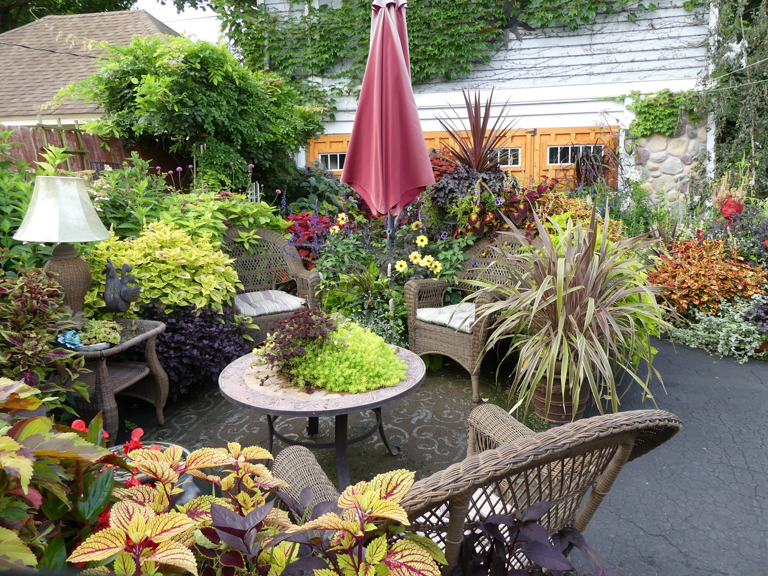
In this photo of the same seating arrangement taken from a different angle, you can see some of the plantings echo the colors of the umbrella and the garage door.

I am certain I didn’t perceive the colors in this garden the way the owner did!
from Cold Climate Gardening http://ift.tt/2EUYjxd
No comments:
Post a Comment